

The Hertzsprung–Russell diagram, explained simply
One chart. Temperature across, brightness up. If you learn one diagram in astronomy, learn this one.
4 min read · Published 26 August 2026
First, the answer
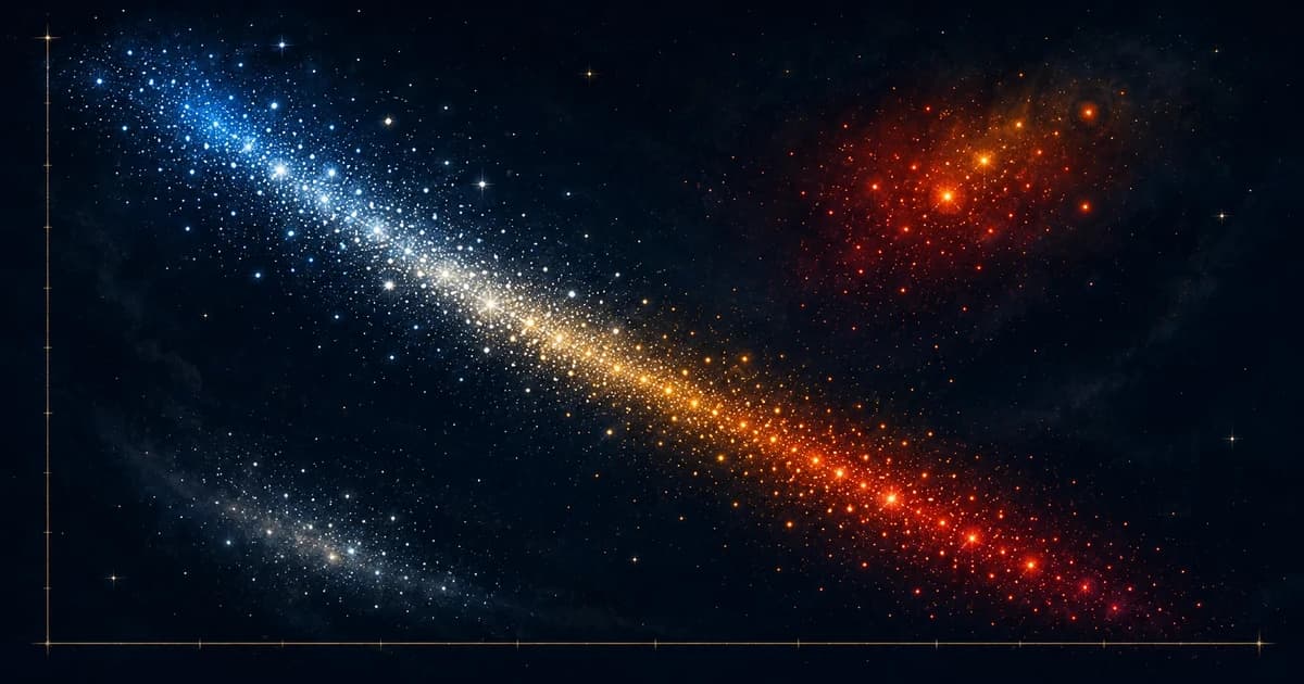
The Hertzsprung–Russell diagram plots stars by temperature on the horizontal axis and luminosity on the vertical. Stars don't scatter at random. About 90% fall along a diagonal band called the main sequence, with red giants above right and white dwarfs below left. The groupings match stages of stellar life, so the diagram became the organising frame of stellar astrophysics.
How to read it
Horizontal axis: temperature. It runs backwards. Hot on the left, cool on the right. A historical accident from ordering by spectral class, and everyone finds it irritating.
Vertical axis: luminosity, on a log scale spanning many orders of magnitude, bright at the top.
So top left is hot and bright. Bottom right is cool and faint. Plot enough stars and the structure appears at once.
If you learn one diagram in astronomy, learn this one. It says more than a shelf of books.
| Region | Position | What it contains |
|---|---|---|
| Main sequence | A diagonal band from top left to bottom right | About 90% of stars, fusing hydrogen in their cores |
| Red giants | Upper right, cool but very bright | Evolved stars that have swollen enormously |
| Supergiants | Top, across the width | The most luminous stars, including Betelgeuse |
| White dwarfs | Lower left, hot but very faint | Dead stellar cores, small and cooling |
Why the main sequence exists
A star on the main sequence is fusing hydrogen in its core, and its position along the band is determined almost entirely by mass.
Massive stars sit at the top left: hot, blue, extremely luminous, and short-lived. Low-mass stars sit at the bottom right: cool, red, faint, and extraordinarily long-lived.
Since stars spend around 90% of their lives fusing hydrogen, that is where you find 90% of them at any moment. The main sequence isn't a sequence stars travel along. It's where they sit while doing the same thing for most of their existence.
Cool but bright is only possible if a star is very large, so red giants sit above the main sequence. Hot but faint is only possible if a star is very small, so white dwarfs sit below it. The diagram encodes size implicitly.
If you learn one diagram in astronomy, learn this one. It says more than a shelf of books.
Reading a cluster's age
This is the diagram's most elegant application.
All stars in a cluster formed at roughly the same time, but massive stars exhaust their fuel far faster. So as a cluster ages, stars peel off the main sequence from the top down.
Plot a cluster's stars and you see a main sequence that stops at a certain point. The turn-off. Above it, stars have already evolved into giants. Where the turn-off falls tells you the cluster's age, because it identifies the mass of star just now leaving the main sequence.
This is a primary method for dating star clusters, and applying it to the oldest globular clusters gives ages of around 12 to 13 billion years, an independent lower bound on the age of the universe that agrees with cosmological estimates.
Its relationship to spectral classes
The temperature axis corresponds to spectral classes O B A F G K M, running hot to cool: the sequence Annie Jump Cannon established at Harvard, described in the women of Harvard's computers.
The Sun is a G-type main sequence star. O and B types are rare and enormously luminous; M types are the red dwarfs that make up the majority of all stars.
The lettering is famously non-alphabetical because the classes were originally ordered by hydrogen line strength and later reordered by temperature, with redundant classes dropped. It's a fossil of how the classification developed, preserved because too much literature depended on it to change.
Still wondering
- What is the Hertzsprung-Russell diagram?
- A plot of stars by temperature on the horizontal axis and luminosity on the vertical. Stars fall into distinct groups instead of scattering, about 90% along the main sequence, with red giants above right and white dwarfs below left.
- What is the main sequence?
- The diagonal band containing stars that are fusing hydrogen in their cores, which is about 90% of all stars. A star's position along it's determined almost entirely by mass, with hot luminous massive stars at the top left and cool faint ones at the bottom right.
- Why does the temperature axis run backwards?
- A historical accident. The axis was originally ordered by spectral class, which had been established before the temperature sequence was understood, and the convention stuck once the literature depended on it.
- How is the diagram used to date star clusters?
- All stars in a cluster form at once, but massive stars evolve fastest, so they leave the main sequence first. The point where the cluster's main sequence stops (the turn-off) identifies the mass of star just now evolving, which gives the cluster's age.
 Natalie Hasselbank